CogCo
Redesigning CogCo's website
Redesigning CogCo's website
I redesigned CogCo's website to better reflect the company's global growth and updated brand pillars
I redesigned CogCo's website to better reflect the company's global growth and updated brand pillars

The challenge
The challenge
CogCo’s website was outdated and not reflective of our scale, expertise, reputation and work. Building on work done to define our brand pillars and tone, my job was to translate that into a brand new website that would showcase these and attract new business. The three brand pillars we wanted to exemplify through the website were our specialist expertise, global reputation and cutting-edge methods.

CogCo’s website was outdated and not reflective of our scale, expertise, reputation and work. Building on work done to define our brand pillars and tone, my job was to translate that into a brand new website that would showcase these and attract new business. The three brand pillars we wanted to exemplify through the website were our specialist expertise, global reputation and cutting-edge methods.
The result
A new site that utilised CogCo’s branding and design system in a fresh way, transforming the old site into a updated representation of the company’s growth and development over the last 6 years.
A new site that utilised CogCo’s branding and design system in a fresh way, transforming the old site into a updated representation of the company’s growth and development over the last 6 years.
The approach
The existing site felt static and outdated, and did not capture the breadth of work we had done, both internally and externally, over the past few years
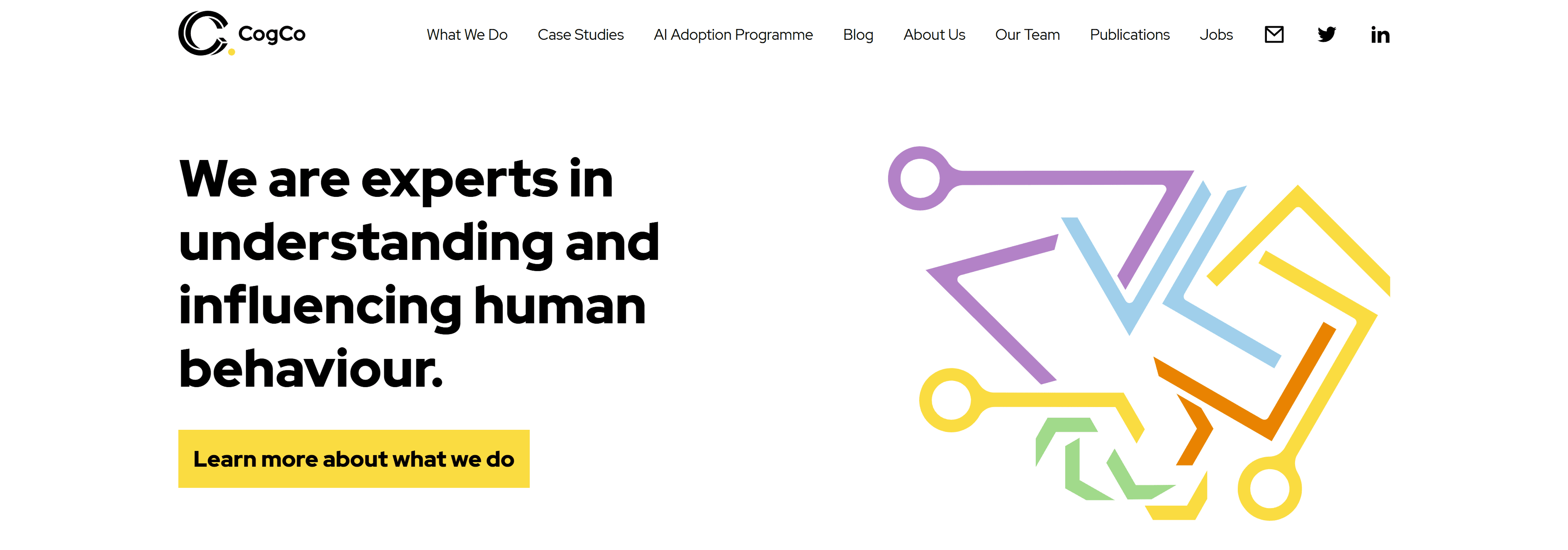
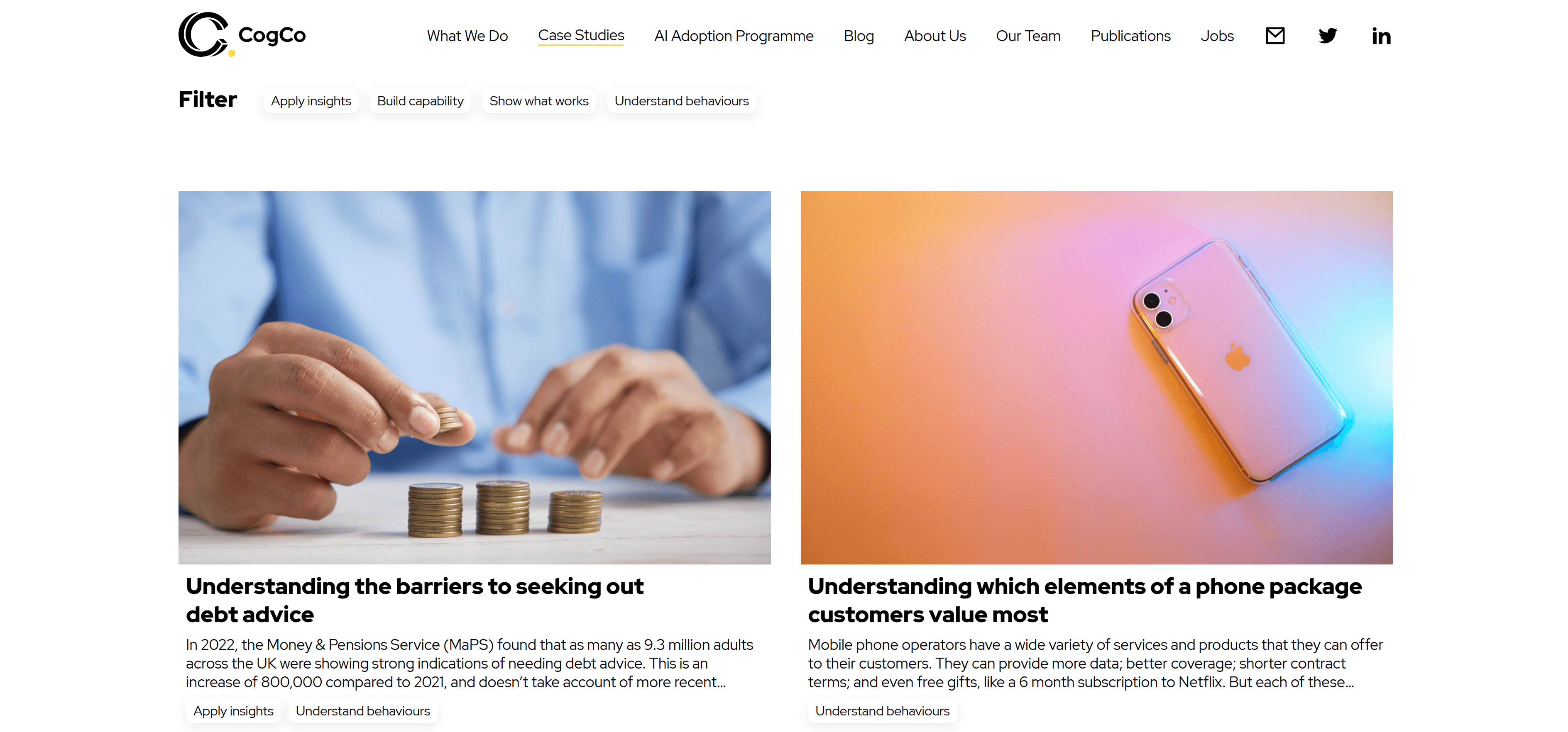
The existing site felt static and outdated, and did not capture the breadth of work we had done, both internally and externally, over the past few years
As this was a big overhaul and an internal refresh, I had the scope to experiment with different visual directions. I started by sourcing inspiration from various sites that aligned with the sentiment we wanted to convey through our site: innovative, global, expert and trustworthy, as well as taking inspiration from sites that had a similarly bold colour palette. These acted as an initial ideation point for sketching my layouts before moving into high fidelity screens in Figma that could be taken into Claude Code.
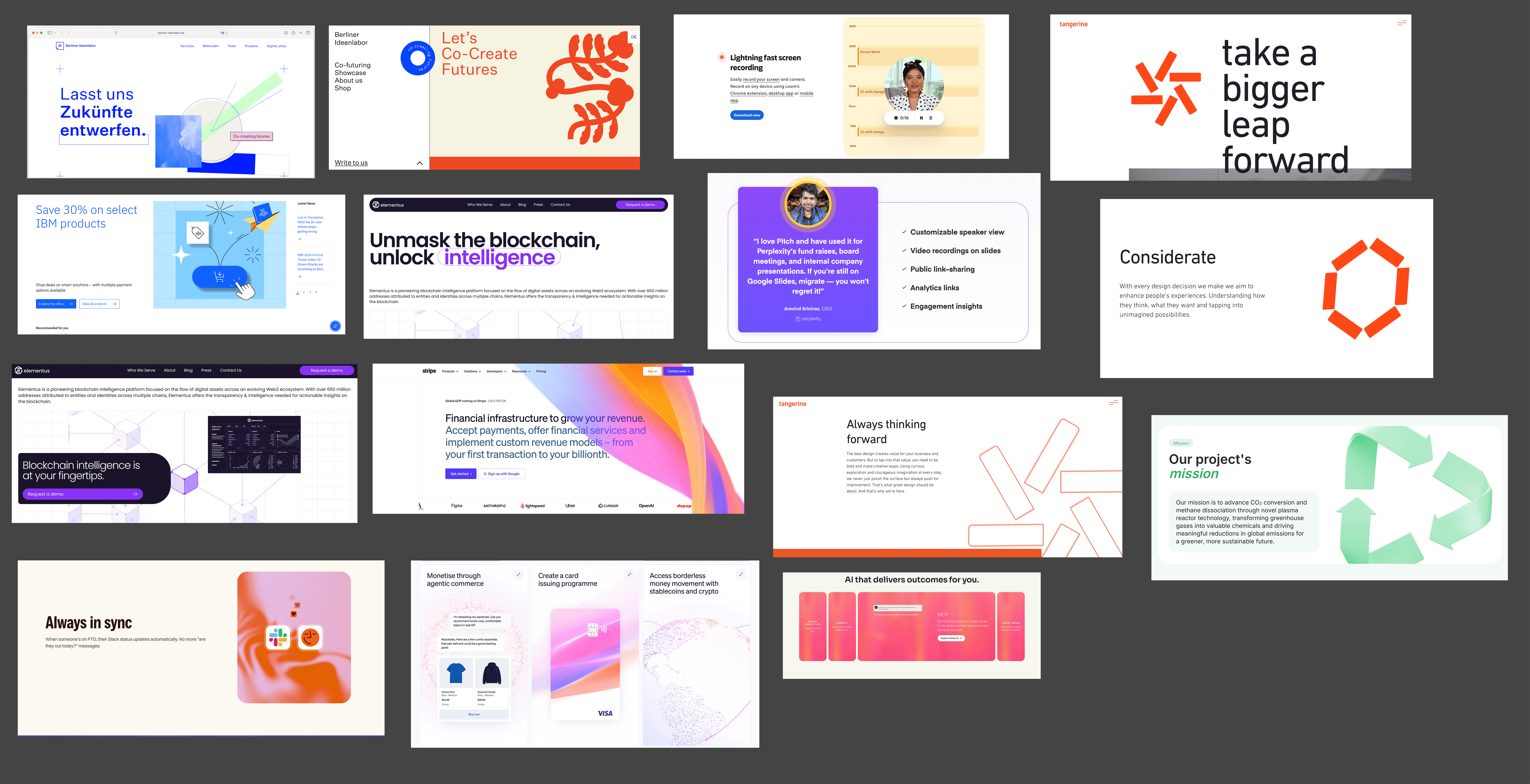

As this was a big overhaul and an internal refresh, I had the scope to experiment with different visual directions. I started by sourcing inspiration from various sites that aligned with the sentiment we wanted to convey through our site: innovative, global, expert and trustworthy, as well as taking inspiration from sites that had a similarly bold colour palette. These acted as an initial ideation point for sketching my layouts before moving into high fidelity screens in Figma that could be taken into Claude Code.
The first version of the prototype drew more on the bold colours of CogCo's secondary palette to showcase confidence and a fresh design, but given the brightness and playfulness of the palette, I decided this did not convey the brand voice we wanted.
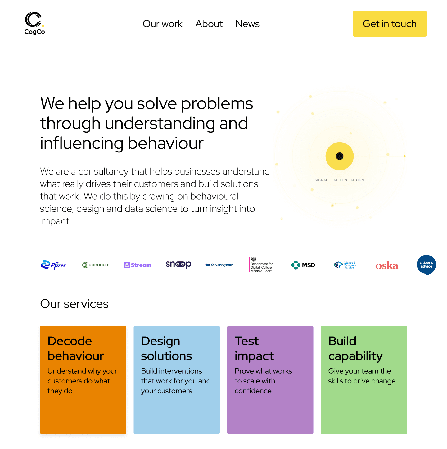
The second, and ultimately final, visual direction leaned much more heavily into the boldness of our primary colours, black and yellow. This version required a lot of iteration as it was a complete shift away from the light mode and little yellow currently used at CogCo, and I experimented a lot with how to incorporate the colours together. Throughout this process I had regular check-ins with the senior designer on my team, as well as the Executives, to ensure we were consistently aligned on the direction of the design and keeping it reflective of our brand pillars.
The end result was a modern site reflective of CogCo’s growth over the years and where we were now as a company.
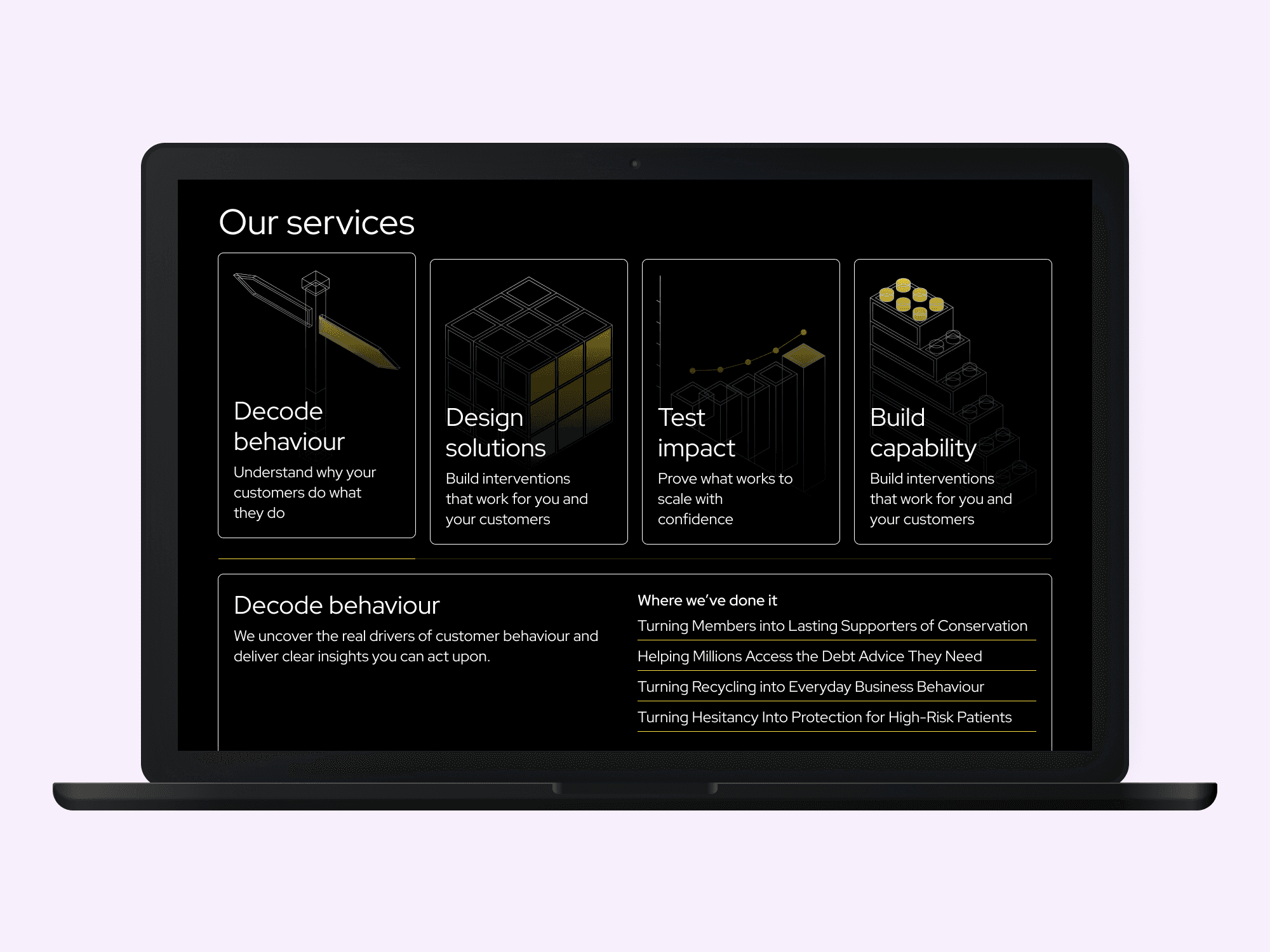
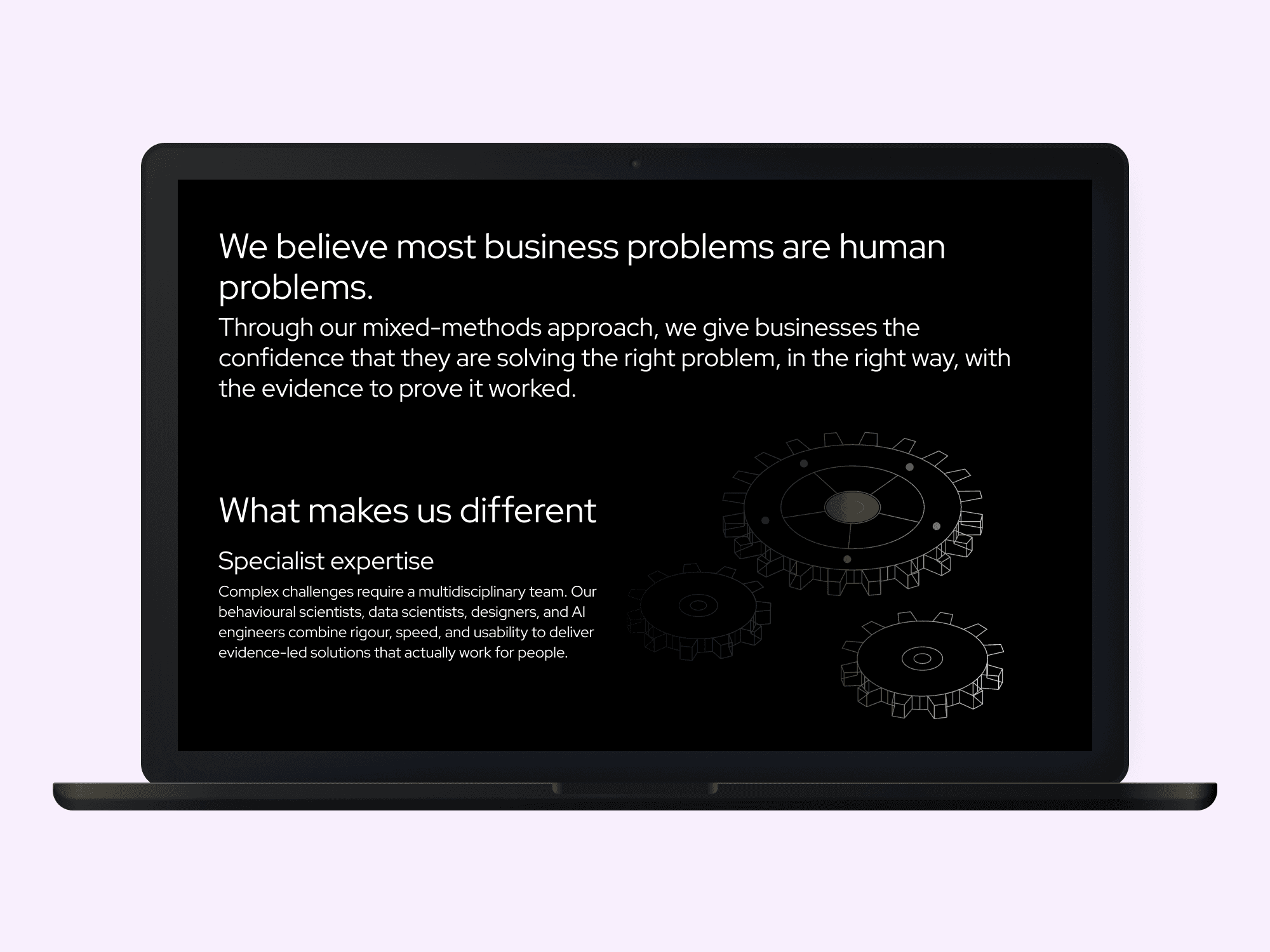
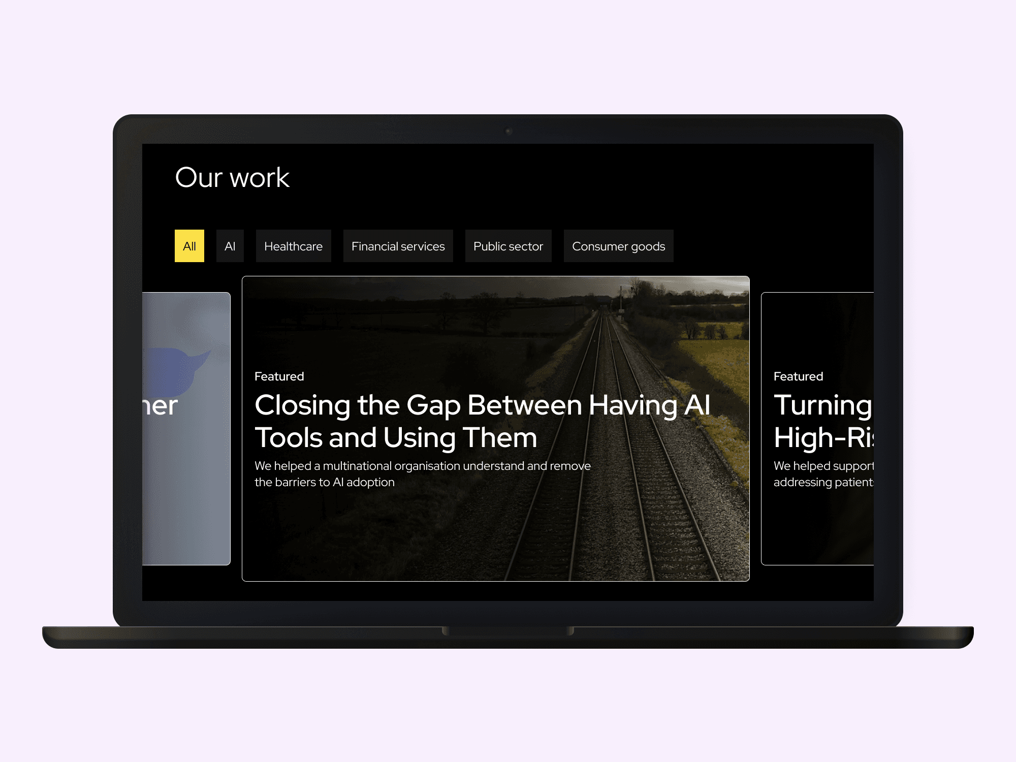
Alongside this was an updated design system and a custom Claude skill to create illustrations that could be used not only on the website, but across our internal and external work. This was also the first use of a Figma and Claude/Claude Code workflow at CogCo, making it a great source of insight into how we could begin incorporating AI into our design work.
The first version of the prototype drew more on the bold colours of CogCo's secondary palette to showcase confidence and a fresh design, but given the brightness and playfulness of the palette, I decided this did not convey the brand voice we wanted.
The second, and ultimately final, visual direction leaned much more heavily into the boldness of our primary colours, black and yellow. This version required a lot of iteration as it was a complete shift away from the light mode and little yellow currently used at CogCo, and I experimented a lot with how to incorporate the colours together. Throughout this process I had regular check-ins with the senior designer on my team, as well as the Executives, to ensure we were consistently aligned on the direction of the design and keeping it reflective of our brand pillars.
The end result was a modern site reflective of CogCo’s growth over the years and where we were now as a company.
Alongside this was an updated design system and a custom Claude skill to create illustrations that could be used not only on the website, but across our internal and external work. This was also the first use of a Figma and Claude/Claude Code workflow at CogCo, making it a great source of insight into how we could begin incorporating AI into our design work.


